- Employment is one-half of the Fed’s dual mandate, so it’s no surprise that investors keep close watch on piles of data that offer clues into economic strength and the path of interest rates.
- The headline nonfarm payrolls number compiled by the US Bureau of Labor Statistics gets all the fanfare, but it’s critical to dig deeper and look at the two underlying surveys that feed into that monthly report.
- Given all today’s economic uncertainties, it’s vital for investors—or their asset managers—to correctly decipher the employment data in order to position client portfolios for success.
Economic vista: All eyes on employment
There’s no doubt that employment data attracts the eyes of all market participants. For starters, it is a key input into the Federal Reserve’s (Fed) forecasts and subsequent policy actions by the Federal Open Market Committee (FOMC). But let’s face it, the jobs data is deeply personal, too. It impacts us all on some level. So, with that in mind, we wanted to go deep into this topic and explain how the employment data can offer important clues into the strength of the economy and, ultimately, for portfolio positioning.
Employment is one half of the Fed’s dual mandate—the other being stable prices, or inflation control. As always, investors often become fixated on several different employment reports and try to extrapolate that data into the views and future actions of Fed members. These include nonfarm payrolls, weekly jobless claims, ADP National Employment Report, and others. The real challenge comes in interpreting the data. This is complicated given all the variables in play, which include a new administration in the White House with a new economic philosophy, along with ever-present technological changes that can reshape job markets quickly.
Presently, the economic outlook is highly uncertain thanks to the recent proposed tariffs and other government policy announcements. Investors are trying to determine how consumers and businesses will respond to the changes, and what the subsequent second and third order implications to those responses will be. Unfortunately, there are few real-time indicators to help determine the trajectory of the economy—almost all economic data is rear view facing—and thus investors are forced to dig deeper to spot early warning signs. In addition, during periods of dramatic change as we are now experiencing, it becomes even more important to understand how data is gathered.
Before diving into the different employment reports, let’s review some the general categories individuals may fall into.
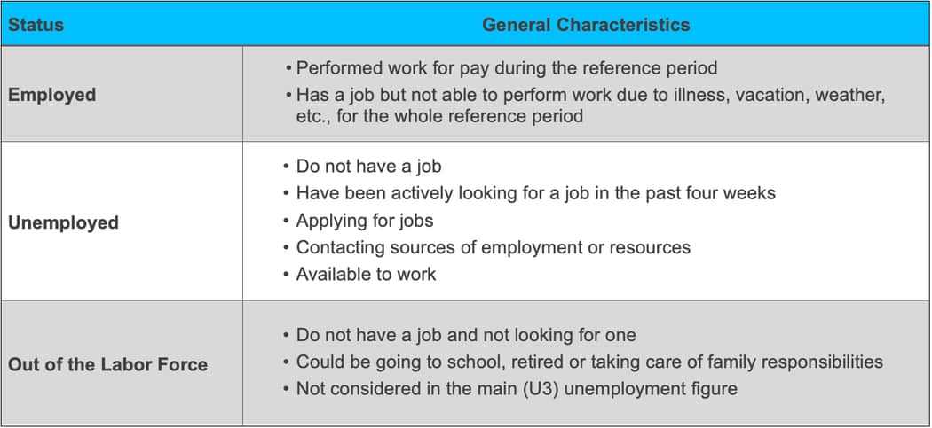
Source: Bureau of Labor Statistics
The big dog: Nonfarm payrolls
The monthly nonfarm payroll report produced by the US Bureau of Labor Statistics (BLS) is one of the most closely watched economic data reports every month. It is a comprehensive report that is comprised of two major surveys, the Current Employment Statistics (CES) and Current Population Survey (CPS). Each of these surveys has some slight differences, but both are used as key inputs into the larger monthly employment report. The CES surveys approximately 120,000 businesses and government agencies, representing over 600,000 worksites and roughly 30% of all nonfarm workers, while the CPS surveys about 60,000 eligible households. Both surveys gather their data around the 12th of each month and generally report the data the first Friday of the following month. The CES survey asks respondents (business/government offices) for employment data from the pay period that includes the 12th of the month, while the CPS only collects data for the calendar week that includes the 12th of the month. The length of the pay period can vary widely between employers. Thus, in a dynamically changing landscape, slight timing differences could lead to some notable discrepancies.
From a high level, there are some important differences between the surveys, including who is included and excluded. The CES survey has a bit more restrictive focus where it excludes agricultural, self-employed, unpaid family business employees, and workers in private households, among several other groups. Meanwhile, the CPS survey largely includes employees in these sectors. Although individuals have been adapting to an ever-changing economy, the survey methodology has remained mostly static in its design. Thus, investors may need to dig deeper to see what may be driving certain data points. Given the CES survey speaks directly to employers, we think there is a very real possibility for the survey to overcount employment due to individuals holding more than one reportable job. Since the CPS survey speaks directly to individuals, they will report themselves employed whether they have one or more job but would still only be counted as employed once.
Each survey has an important role in building the overall nonfarm employment report. The CES survey produces the main nonfarm payroll gain/loss figure, hours worked, and wages earned, while the CPS survey produces the unemployment and participation rates.
Shifting structure of the workforce
Over the past decade there have been some structural shifts in the economy where individuals are more engaged in the gig/self-employed economy (or working more than one job, as mentioned). These shifts could further exaggerate the differences in the surveys and could decrease reliability of the data.
Because the reports do not change dynamically as the economy shifts, it is difficult to tease out some of the themes that otherwise could lead to an incomplete view of the employment market. The BLS has tried to bridge this gap by producing the Contingent and Alternative Employment Arrangements report that focuses on individuals who are independent contractors or other loosely attached employment statuses. Unfortunately, the BLS does not produce this report on a frequent or even predictable cadence.
The table below shows roughly 30 years of results from the BLS survey. The two main categories we can focus on are Contingent Jobs and Independent Contractors. Contingent Jobs are those that the employee does not expect to last due to the temporary nature of the role (seasonal help, covering for another worker, etc.). Independent Contractors are those who work on an independent basis. Within the data, an independent contractor can also fall into the contingent job category depending on several factors. The main takeaway is that we have seen an increase in both contingent jobs, as well as independent contractors, from 2017 to 2023. Anecdotally, we have seen a major adoption of gig platform employment during the past five to 10 years. It will be interesting to see if this trend continues when the BLS releases the next report. This newer form of employment may reduce the reliability of the overall employment reports.
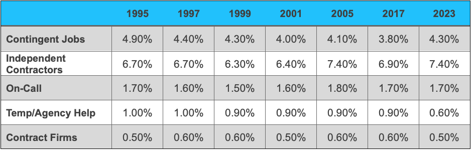
Source: Bureau of Labor Statistics
Weekly initial and continuing jobless claims
Every Thursday morning the US Department of Labor releases data based on the submissions of individual state level unemployment claims and those who continue to receive benefits.
Initial jobless claims count the individual application jobless benefits in the previous week. Eligibility of jobless benefits are largely handled by individual states, but once again this data also excludes self-employed and gig workers. Market participants should be keeping a close eye on initial jobless claims as they can provide a much closer real time sneak peek into the labor market. A sudden and consistent increase in jobless claims may cause investors to reassess their view of the labor market. Investors will also pay close attention to the initial jobless claims data around the weeks of the nonfarm payroll surveys. Sudden spikes in jobless claims do occur, but they can largely be explained by idiosyncratic events impacting certain regions or segments of the economy. This could include hurricanes or other weather events, wildfires, or major labor strikes impacting the auto industry, as just a few examples. Investors tend to look at the four-week moving average to help judge the trajectory of the labor market.
Marrying the initial jobless data with the other key data point—continuing jobless claims—can add another layer of insight for market participants. Continuing claims are released with a two-week delay and report how many people are currently receiving jobless benefits through their state level programs. A move higher or lower in continuing claims can provide insights into the health of the labor market and economy. Comparing and contrasting this data with initial jobless claims can allow for potentially deeper understanding of labor market dynamics. For example, if the labor market reveals stable or declining continuing claims while initial jobless claims are rising, is the labor market strong or weak? The labor market might be naturally shuffling workers around. Coming to the correct conclusion is tricky and might require extrapolating and when combining several data points.
Looking at long-term trends of claims
Over the long term, initial jobless claims and continuing claims track very closely with each other with a correlation of 0.93, excluding data from March 20, 2020, to September 30, 2020. Including data from the initial effects of COVID-19 significantly distorts the graph, as initial jobless claims and continuing claims peaked at over six million and 21 million, respectively.
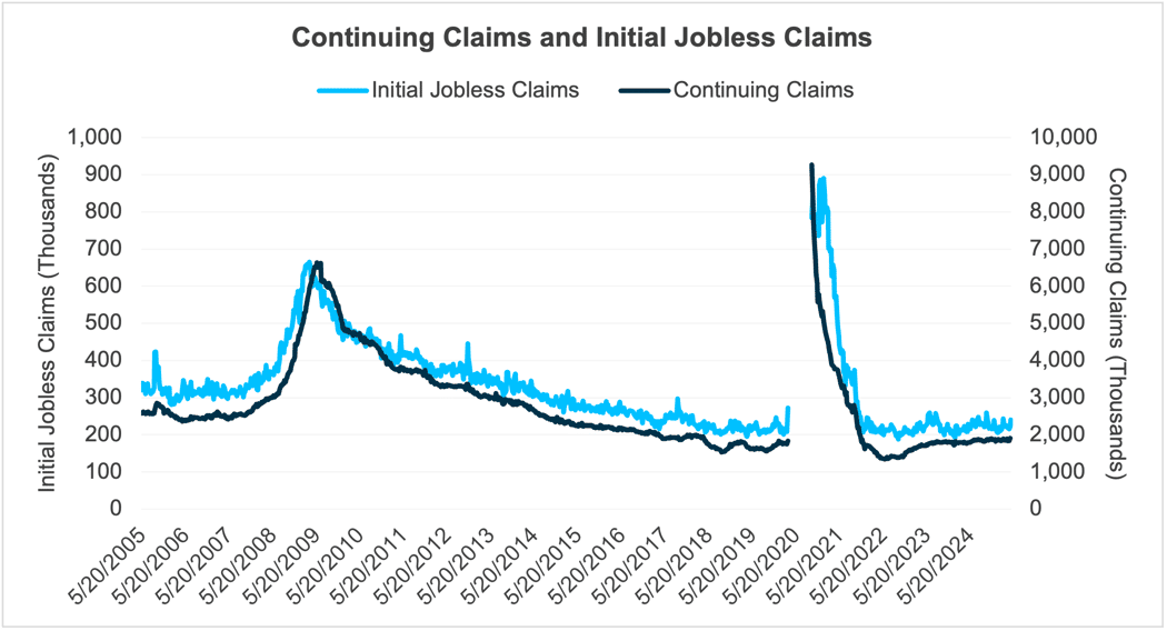
Source: Department of Labor, Bloomberg. Data as of 04/30/2025.
ADP National Employment Report
The ADP National Employment Report is conducted monthly by ADP and typically reported on Wednesday of the week of the nonfarm payroll report. The report derives its data from the more than half a million companies and 25 million employees using their payroll service.
The headlines will report the aggregate job change for the month, but ADP also provides extensive data on industry, regional, and wage data. Thanks to this robust data set, investors may be able to spot early warning signs in the labor market. While this report does provide some insights into the private labor market, it is just a slice of the overall employment market. When comparing the ADP report to the nonfarm private payroll report, the correlation is relatively weak at 0.61. The graph and correlation figure exclude data from the six-month period of March to September 2020 during COVID. Including the additional six months of data increases the correlation to 0.73 but given the noise in the that six- month period, the data ex-COVID is likely a better reference.
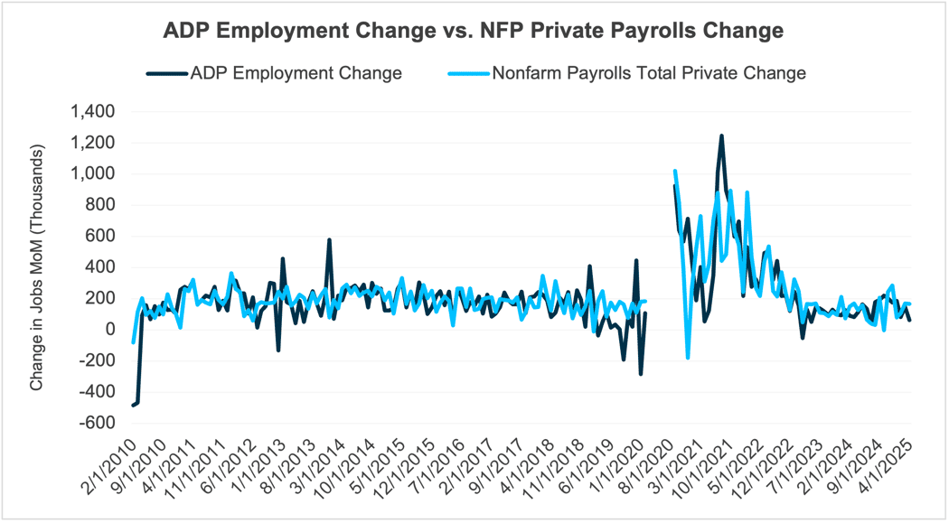
Source: Bureau of Labor Statistics, ADP, Bloomberg. Data as of 04/30/2025.
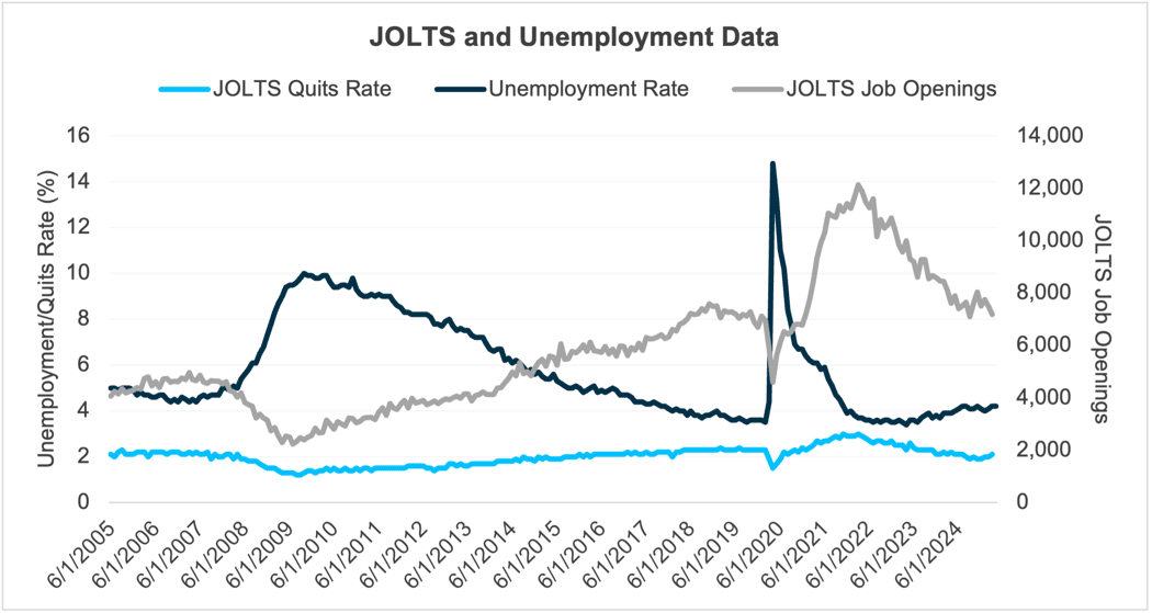
Job openings and labor turnover survey (JOLTS)
The JOLTS report is produced by the BLS and typically released on Tuesday of the week of the nonfarm payroll report but lagging the nonfarm payroll report by one month. The JOLTS report is not just another indicator of jobs added, like the nonfarm payroll and ADP reports. Rather, it provides detailed industry/regional data on job openings, separations, layoffs and voluntary quits. The detail within the JOLTS report can create a valuable view on the labor market, but at very granular level. However, due to the slight delay in its release, the actionability of it might be less useful in a rapidly shifting market.
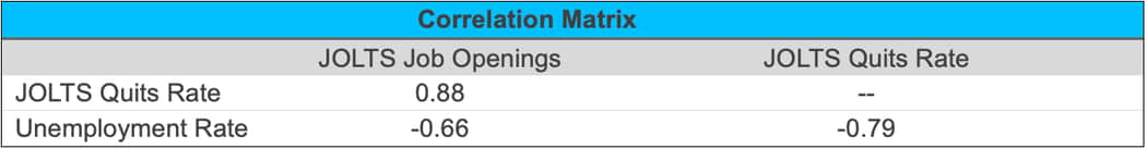
Nevertheless, there is value in this report when viewed in the context of a trend and with a forward-looking bias. The report focuses on job openings within the public and private markets and can be thought of as a measure of how tight or loose the labor market is. As job openings increase, employers are signaling optimism in the economy as they are willing to expand their workforce, and the opposite can be implied as job openings decrease. The “quits rate” can provide insight into how employees feel about the health of the labor market. In an uncertain economy employees might be motivated to stay in their current role rather than seek out a new opportunity and become the newest hire (and with the least seniority) at a firm. Coming out of the COVID-19 pandemic we saw both job openings and the quits rate materially increase. Employers were actively seeking new employees, and employees were confident in finding new jobs at a higher wage. We also witnessed some of the lowest unemployment rates on record during that period.
Looking at data going back to June 2005 (when ADP began their series), we see some themes in the correlation matrix as well as the graph below that the themes noted above hold strong correlations. As described above, when the unemployment rate increases, we tend to see a drop in job openings and a falling quits rate and when the unemployment drops the quits rate increases.
Source: Bureau of Labor Statistics, Bloomberg. Data as of 04/30/2025.
Source: Bureau of Labor Statistics, Bloomberg. Data as of 04/30/2025.
No small task
As the economy and country enter unchartered territory, we will continue to dissect, analyze, and interpret all the employment data points to better position our clients for success. Simply looking at the headlines and drawing conclusions is risky at best. Recently, we’ve seen some early warning signs within the details of these reports regarding the health of the economy, but it’s too early to draw definitive conclusions in our opinion. We want to see if the recent data is just noise from the upheaval of our economic norms, or a true signal of weakening. Time will tell. But as you can see, monitoring the employment data is no easy task for individual investors or busy corporate Treasury departments. Fortunately, our team spends a great deal deciphering all the “jobs” data, and we think this gives us an advantage when it comes to structuring fixed income portfolios.
Trading vista: Coming to terms with tariff talk
Jason Graveley, Senior Manager, Fixed Income Trading
Tariff talk dominated the headlines and rankled investors throughout April. But May began with a more muted tone–and dare I say—a more pragmatic response to the potential secular shifts in global trade. An onslaught of tariff announcements sent markets into a tailspin through the middle of April, but the administration has walked back much of the rhetoric, and an uneasy calm has descended. Credit spreads, which widened significantly as volatility moved to yearly highs at that time, have retraced much of their movement and are now more aligned with normal market technicals.
Another signal of normalization—or at least acceptance of the current situation—was the fact that US investment grade primary issuance came out in force to start the month. Perhaps this reflects a desire to get ahead of the May FOMC meeting, as well as a re-awakening of investor appetite, which often tends to go dormant amid higher levels of uncertainty. A well-functioning primary market, where issuers can tap the market and access capital with ease, is closely watched as a sign of relative market health and stability. April new issuance figures were lower than originally forecasted, which was expected given the market dynamics at the time. However, investors emerged in May, and borrowers enjoyed the best two-day period since February earlier this month. And to further that point, the S&P 500, which hit a low on April 8th for this year, is now higher than it was before the first tariff announcement on April 2nd, as of the writing of this in early May. It’s also notable that recession odds appear to have fallen dramatically from their 60% probability at the peak of the volatility in April. Today, many pundits expect a moderate economic slowdown rather than a severe recession. The most recent jobs report has reaffirmed the cautious optimism, although labor market uncertainty is likely to continue weighing on investors in the short-term.
Of course, it’s way too early to signal the “all-clear” just yet. All that uncertainty doesn’t just disappear overnight. As mentioned previously, this administration has always seemed to prefer some level of unpredictability in its negotiations and maneuvering. While the tariff headlines have subsided for the moment and the administration has announced a trade deal framework with the UK (and a pullback in China tariffs for now), investors should be prepared for the unexpected. Further bouts of volatility are likely as sentiment can and will shift again, perhaps swiftly.
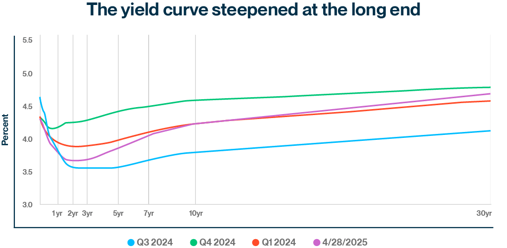
For its part, the Federal Reserve recognizes the delicate nature of investor sentiment and has preached patience, noting that the economic risks of waiting to cut rates further are fairly low. Yes, Chairman Powell commented that near-term inflation expectations have moved up. But for now, the Fed believes policy rates are in a good place and seems disinclined to either tighten to ward off inflation or ease to boost economic activity. The market is currently pricing two small rate cuts later this year, with the first not slated to begin until September. This is a shift from earlier in the year where there were up to four cuts priced into the 2025 calendar. Projections for fewer moves have pushed rates higher, as the yield on the two-year Treasury note has moved from a low of 3.60% on April 30th to over 3.95% as of May 15th. Even though rates have already moved higher as monetary policy expectations were recalibrated, some level of short-term volatility can be expected in this environment. Plus, the effects from the new policies have also not manifested in the economic data yet, so each coming report and economic release will be closely scrutinized, and any surprises could fuel volatility. The tariff talk could change quickly, but for now the Federal Reserve is preaching patience, so I guess we’ll have to follow Chairman Powell’s lead. Stay tuned.
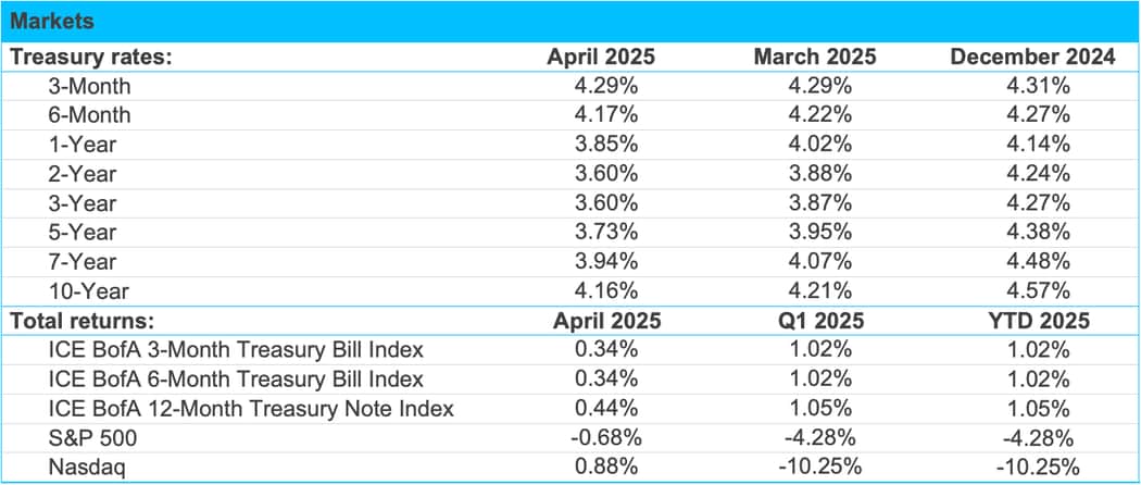
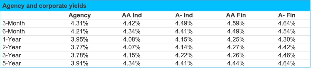
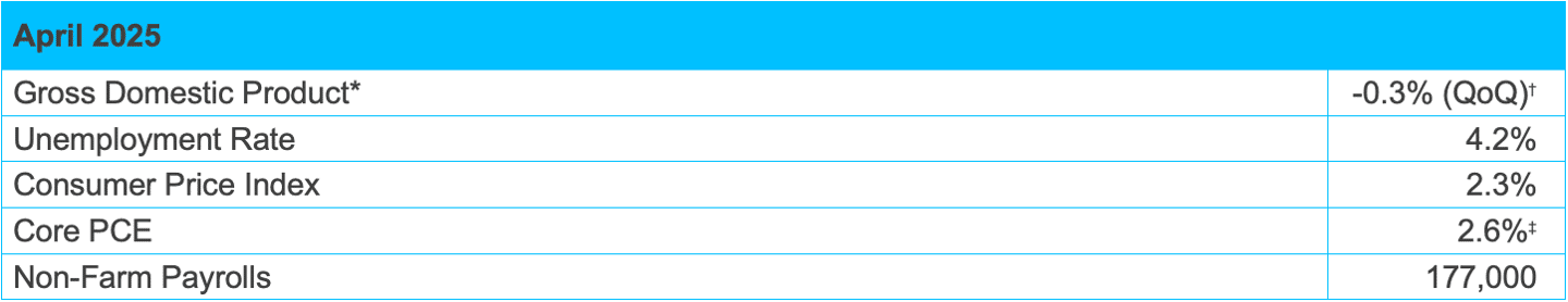
Source: Bloomberg, Tradeweb and SVB Asset Management as of 04/30/2025.